Revenue Trend Over Time
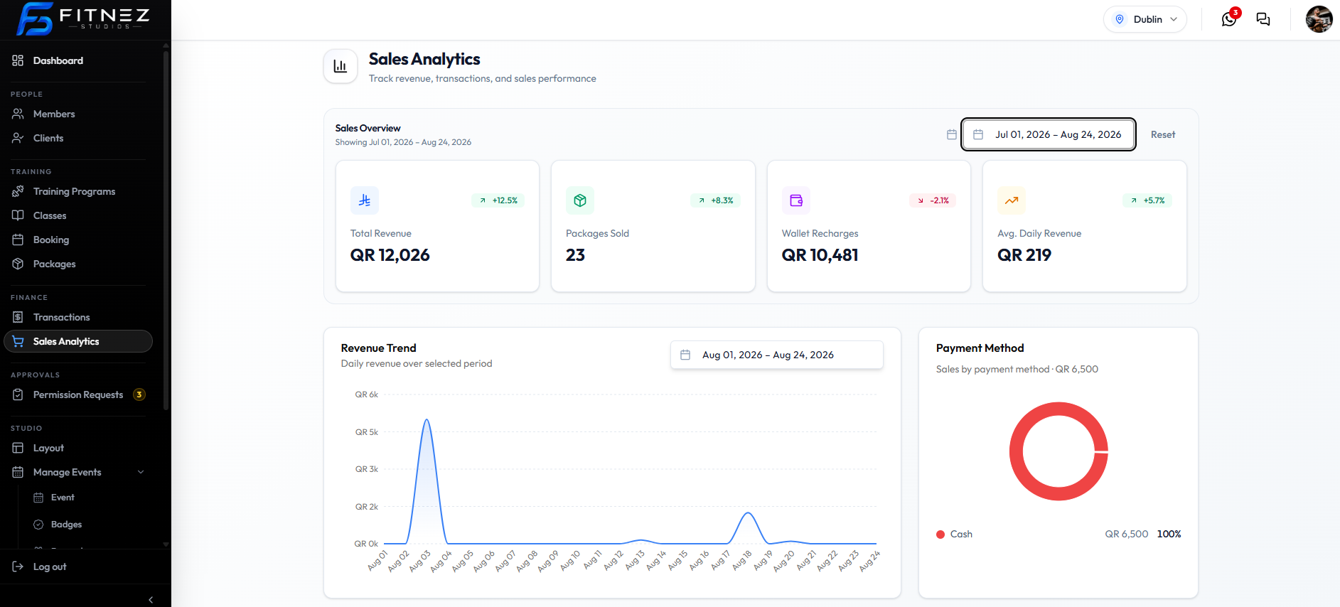
Revenue Trend is the line chart on Sales Analytics. The subtitle is Daily revenue over selected period.
On this screenshot the chart range is Aug 01, 2026 – Aug 24, 2026 — not the same as Overview Jul 01, 2026 – Aug 24, 2026. Use the labels on each block.
How to read the chart
| Part | On this screenshot |
|---|---|
| X-axis | Days in August 2026 |
| Y-axis | Revenue from QR 0k to QR 6k |
| Grouping | Daily (from the subtitle) |
A tall point is a high-revenue day. On this capture there is a large spike around 3 August (above QR 5k) and a smaller rise around 18 August. Other days sit near the bottom of the scale.
That tells you when money came in during the chart period, not who paid. For one sale, use Transactions.
Weekly or monthly grouping of this line chart is not shown. The chart is labelled daily.
Related Articles
- Sales Summary
- Choosing the Right Date Range
- Dashboard Overview — Today’s Revenue is a single day
Last updated on